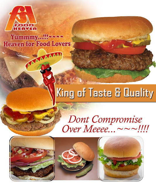
For this task we had to do some research into different type of food posters to get some ideas on what we would like to do and create for our own.
I really like this poster because, it is colourful and i think that is a main thing to have in your poster, to make it eye catching and jump out to people. I also like how it is playful and not too serious, its almost cartoon theme, but still very perfeshinal, i would definitely give this place a visit.
Again this is similar t the first one it is playful and colour full and i think a theme is important, its Mexican and you can easy see that from the design, again it cartoonist which i think makes it welcoming.
i like this one because it looks like a movie poster which is the intention, i think this is really effective and definily makes you look twice, personally i would not use this i was mine to be more fun and bright, welcoming and almost homey.
I really don't like this one it is my least favourite it looks cheap and the food looks horrible, it doest look perfeshinal it looks like someone made it in 5 minutes. I also feel like there is too much on the page or it inst organised very well. It also doesn't really say much about its self it is really limited.
I do like this one it is very simple but I think it works really well, simple but effective, the spices look really nice well presented and tidy and even know it is simple, it appears like someone put time and effort into this poster.
This one really stands out to me, i think it is because of all the lovely bright but smooth colours are really pretty and all the images of sweets, they look cute and appetising even as little cartoons. I love the old styles sweet shop thing at the top of the page, how it gives you the name of the place and says the best in town and again it is really homey and welcoming, it isn't too fancy and isn't too unprofessional. Its lovely.


No comments:
Post a Comment