Monday, 26 October 2015

LP Record Covers

The Rolling Stones Grrr Album. All editions feature artwork by Walton Ford. The artwork depicts a gorilla with the Stones' tongue-and-lips logo.
I really like this Record Cover it is really effective because it stands out so much, because of the bright colours and because it is so different, even know i haven't seen somthing that looks this good and that really grabs your attention. 
This piece of work is not a photograph it it art work, which will make it so much more interesting when trying to recreate this cover. I am not sure what type of art this is i would maybe call it abstract myself because it definitely isn't realistic. 
From what i can tell about the 60s is that this is when things started getting a bit dark and naughtier, people were becoming more daring and impulsive almost. I definitely think that album covers became more experimental, i noticed when doing some research that a lot of albums contained nudity but in a classy and almost modern way, which i found really interesting. 

I had to find another album because this one was too resent so i chose Let it Bleed instead. 

The album cover displays a surreal sculpture designed by Robert Brownjohn. The image consists of the Let It Bleed record being played by the tone-arm of an antiquephonograph, and a record-changer spindle supporting several items stacked on a plate in place of a stack of records: a tape canister labelled Stones – Let It Bleed, a clock dial, a pizza, a tyre and a cake with elaborate icing topped by figurines representing the band. The cake parts of the construction were prepared by then-unknown cookery writer Delia Smith.The reverse of the LP sleeve shows the same "record-stack" melange in a state of disarray. The artwork was inspired by the working title of the album, which was Automatic Changer.
I Really don't like this album cover at all i don't think that it relates at all, the album is called let it bleed and the photo is of a cake i think that it is the complete opposite to what they are trying to say. The contrast is good between the colours but i still don't think that it is appropriate.

For the 70s i have chosen Pink Floyd Wish you were here. 
I decided to do this cover because i think it looks the most interesting and i think that it opens up a lot of ideas and you can be creative with it because of the name and because of the original cover image. 
Artwork by Storm Thorgerson (Hipgnosis) and taken at Warner Brothers Studios in Burbank, California. 
I think that this is very effective and works well with the name of the record, if you listen to the song it ways ''So, so you think you can tell Heaven from Hell, blue skies from pain.'' and i think that this is what the artist has tried to show in the Record Cover, Heaven and Hell. I think the album cover and song is trying to say that another mans hell is another mans heaven and even know it seems right maybe it isnt. Almost like you should listen to your heart. 
''And did they get you trade your heroes for ghosts?''

I know that this was created at a location from research, it is very effective and works well with the final outcome. I think that personally this is going to be a hard cover to recreate because i would want it to be as meaning full and to really jump out to people and make them think. 
I think that the hair fits very well with the 70s they had really big hair back then which they have in this photo even know most people didn't wear suits any more these to me are business men so a suit never goes out of fashion. 

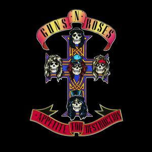
This is the Cover that i have chosen for the 80s I did used to listen to them a little bit when i was younger so i already know what type of music they play. I could not find who created this work but I am assuming it was a graphic designer. I do like this i think the design is very interesting and fits very well with the time, eveyone was a bit punk and dark back then with the leather jackets and the big messy hair everyone looked a bit crazy. I think it would be interesting to do a black and white photograph with just some bits of colour involved, i think that obviously the guns and roses are important in this image. 

Thursday, 22 October 2015

Task 1 Research and Mood Boards

Task 1 Research and Mood Boards

Photographer Shirley Baker was the only female photographer documenting British street scenes between the 1960s and the 1980s. 
Her work featured urban areas in Manchester and Salford at a time of major social change, catching the dying days of a previous era.  


This picture from the 1960s shows a young traveller girl standing amid the rubble of an area of deprivation in Manchester


I love this photograph it really jumped out at me because it is so shocking, you don't see anything like this any more, this image has so much for you to look at and then there is this young little girl standing in the middle of all this rubble and destruction. This is the type of photographs i want to produce, something that people have to look twice at and makes the wonder.
I really like this photo again because it makes you look twice, parents would go crazy if they saw there kids doing this nowadays. This photograph smile, i love how adventurous and almost naughty these little kids are being, I love how they have no fear at all, personally i would be terrified of falling down but these two young boys couldn't care less.
I love how they could go outside and find anything to do and now kids don't even leave there bedrooms, young children has to choice but to be creative now they have computers and play station.

 New York in the 1980s was an altogether different city from the safe, clean (for the most part), cosmopolitan urban playground it is today. Photographer Richard Sandler began taking pictures, which now tell a fascinating story of a gritty, graffiti-strewn city that just 20 years later would be in the thrall of gentrification.


I like these images they are different from my other ones but i think all of these photos have a grate juxtaposition. I really like black and white photos they are really effective and always have good contrast.
These twos photographers focus on photographing the world as they see and and not asking anyone to pose or move then take it and show it how it is.

Music Photographers
Anton Corbijn began his career as a music photographer in the mid 1970s taking pictures of Dutch rock star Herman Brood, before going on to shoot many of music's biggest names at the time — David Bowie, Bob Dylan, Joy Division, U2 and many more. You'll recognize Corbijn's work from album covers, at least, as well as a number of films as a director — most notably, the Joy Division Ian Curtis biopic Control.


I like this work it is really interesting, it really makes you think of what message he is trying to put across and ask yourself what he was tying to say with his photos. Because they are all black and white it gives this lovely dark contrast. I really like how his photographs look and i think that something similar to theses would be really good and interesting idea for one of my final images. 


Monday, 19 October 2015

Ideas and Planning for Cyber Security


Idea
I was thinking about creating a 3d Lenticular image. To make it more interesting to look at and to grab people attention.
Subject (what you are photographing)
My work is going to be focused on Child Exploration because it think this is important and not a lot of children and parents know enough. I want to photograph a young girl talking to a boy on facebook or some kind of social network, I want her to look happy and then when you turn the photo slightly you can see that his face changes to an older meaner looking man and that she is crying and upset.
Location (where you are photographing)
Probably at my home or maybe out in a park I could use my phone instead of a laptop because most young people use phones instead of computers.
Props/items (anything else you may be using to help stage your images)
I am going to need a tripod because I am going to use myself in this work as it will be easier so I will have to use timer.  
Lighting (how will it be lit, natural, artificial and angle of lighting)
I am going to use natural light for the first photo and then a lot darker and harsher light for the second one to make it more scary.
Timing (How long will it take, what time of day)
Probably about an hour on both images, I will need to take both photos at different times in the day, one at midday and one at night maybe.
Cost (will you need to buy anything, are there any travel costs)
I will not need to buy anything as I will already have everything that I need.


Thursday, 15 October 2015

Final Project Evaluation

Final Project Evaluation 

This whole project was based around food photography, though out are whole project we had to focus on different types of foods and photograph them, using different props and techniques. 

For our first task we had to photograph an apple in different locations, i found this task really interesting because we could pretty much do whatever we wanted with this shoot it was good to try new ideas. With this shoot you could really see how lighting can effect your images because we was photographing is loads of different locations and because of the light, i would have to adjust my angle to make it more effective, or use my flash more. Also because i was photographing in a lot of public locations this made me more aware of people and i had to learn to capture my photos without people or cars in which sometimes can take some time. This also gave me a lot of time to experiment with different techniques such as, angles, zooms, reflection and many more. From this task i have leant how to work in different environment and around people, i have also leant how to make lighting more in my advantage and to be more open minded with my ideas.  

Our second shoot was in the studio to introduce us to the studio, the equipment and the health and safety, i really enjoyed working in the studio it was really fun because i had never been in there before it was really interesting and exciting to work with the new equipment. The lighting in the studio was amazing it was so crisp and clear it was lovely to work with and it was great to try out different equipment i haven't worked with before. I also experimented a lot with depth of field in this shoot for the first time, to see what type of effect this would give my photos, i think it is very good to bring the viewers attention to the part of the image you want them to see. I also played around with forced perspective to make my biscuits appear bigger or the same size as my mug.  

We then had to do many independent shoots at home which i found to be a bit dull and a lot less interesting because we didn't have the right type of food. I found that in this food i realised that it is more interesting to take photos of sweets, cookies and pastries because they are sweet and easy to work with, where my dinner that i photographed was harder because of the steam and the texture of the food. I think that the quality of my shoots totally depend on what i am photographing. 

We also had to plan our own shoot i decided to photograph macaroons, because they are fun and colour full which i think are the main attractions of food photography. This was so easy because of the colours and the textures, i think bright things are fantastic to photograph because it always looks amazing because of the light and contrast it brings to your photos, I have also leant that props can play a bit part in your photos they can add so much and make it appear more professional, i also leant that adding cloth or some kind of fabric can make it appear so much ore natural and sit so much better.

Overall i found this project a bit boring i don't personally think that food photography is for me. It was really dull and hard to stay interested in, the only shoots i enjoyed were the studio one and my Macaroon one because they where easier to stay interested in because the studio was new and the the macaroons i liked so i found them easy to photograph. But i have learnt a lot about lighting situations and using props to my advantage to make my work look more appealing. I have also leant how to take photos in public places and avoid people and cars because they can distract the viewer.  

Saturday, 10 October 2015

Cyber Security Research

Cyder Security Research
From my research I have noticed that they have lots of information online but they don't advertise it very well. I would not have know about any off these websites or call lines until I got this project. I think as well as making posters it would be good to advertise it on social media, maybe on the side of facebook or even as a pop up  every time you search someone. I know on tumblr every time you search a related worked to depression or being uphappy, it comes up with a pop up and a link where you can go online and talk to people and get advice, i think somthing similar to that would be grate idea.
Also i think it would be important to let them know that they wont be getting in trouble because i know a lot off young people would be terrified of getting told off or their parents finishing out.

Child Exploration key Points
  • Make sure that they know that have someone to talk to. 
  • Make young people aware off there rights
  • Make them aware off online chats or groups they can talk to about what is happening, sometimes they are too scared to talk on the phone. so someone safe online and something they are familiar with and talk too would help them to feel more comfortable. 
Phishing Key points
  • Make people aware of these types of emails, maybe when you sign up to an email, they should make you aware of these type of things. 
  • Show people how to report them and what to do if they get them also there are online site and if you type an email in it comes up saying if they are fraud related and if anyone else has had similar emails.  
Wi-fi Protection
  • Again its all about making people aware, and instead of posters use people being online to your advantage, post and advertisement online on facebook and twitter so when people go on these apps, they see and realise that this can happen. 
Online Dating 
  • I think that everyone is aware that online dating isnt 100% safe and should know to take extra percolation, not to give out information about where you live and even when you meet someone for the first time to bring a friend and meet somewhere public.  
Child Exploration Ideas 
  1. Was to take 2 photographs one of a girl smiling and talking to a boy her age and another of a similar image but with the girl crying and the boys faced changed to make it appear more scary and a lot older, i was then thinking about turning it into a 3d Lenticular image. 
  2.  

Thursday, 8 October 2015

My Posters

These are 3 of the posters that I created on www.canva.com/create/posters/ 
It helps me with layouts and to make it look more realistic, like it was actually for a food place. 
I had to incle my own photographs and make it look presentable. 

I didn't like this one because i don't think it worked well with my Tea house theme. Its too dark and dull and I saw it in my head to be a lot brighter and inviting. I thought this was a better idea because it allowed me to put more on my photographs on my poster. I think that the colour of my font goes well with the colour of my Macaroons and stays within my theme. 

I did like this one but i thought it was very simple and appeared very plan and dull to look at, it didn't really work the colours didn't fit very well and it wasn't eye catching. I thought the design was a little different to my other posters and appeared more playful. I dont think that the blue goes with my theme very well. 
I really liked this one, even know it was simple with only one image, I thought that it was eye catching and definitely made you want to visit. I love the colours of the macaroons and the colour of the font and the macaroons worked well together.  Also because the box is white it helps it to stand out apart from the world follow but it think that it doesn't matter too much because the macaroons invited you in so make you want to read it so it will become clear.  


Monday, 5 October 2015

Poster Research

For this task we had to do some research into different type of food posters to get some ideas on what we would like to do and create for our own. 

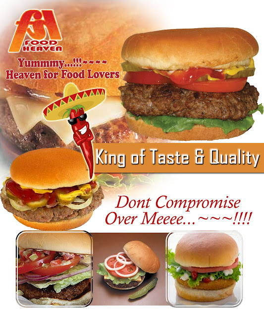
I really like this poster because, it is colourful and i think that is a main thing to have in your poster, to make it eye catching and jump out to people. I also like how it is playful and not too serious, its almost cartoon theme, but still very perfeshinal, i would definitely give this place a visit. 

Again this is similar t the first one it is playful and colour full and i think a theme is important, its Mexican and you can easy see that from the design, again it cartoonist which i think makes it welcoming.  

i like this one because it looks like a movie poster which is the intention, i think this is really effective and definily makes you look twice, personally i would not use this i was mine to be more fun and bright, welcoming and almost homey. 

I really don't like this one it is my least favourite it looks cheap and the food looks horrible, it doest look perfeshinal it looks like someone made it in 5 minutes. I also feel like there is too much on the page or it inst organised very well. It also doesn't really say much about its self it is really limited.

I do like this one it is very simple but I think it works really well, simple but effective, the spices look really nice well presented and tidy and even know it is simple, it appears like someone put time and effort into this poster. 

This one really stands out to me, i think it is because of all the lovely bright but smooth colours are really pretty and all the images of sweets, they look cute and appetising even as little cartoons. I love the old styles sweet shop thing at the top of the page, how it gives you the name of the place and says the best in town and again it is really homey and welcoming, it isn't too fancy and isn't too unprofessional. Its lovely.

Thursday, 1 October 2015

Sunday Dinner

Sunday Dinner 
For this task we had to take 5 photographs of our meals, we had to try and make the food look as appealing as possible. We could also use props and people to make our images more interesting and to give it variety.  
On this task i tried to play around with the focus and the depth of field by focusing on different parts of the food or the areas to see what effect this would give my photos. In this photograph i tried to focus on on the potato's that is why the front of the plate is out of focus.  

On this one i tried to take it from a different angel, i aimed to keep the fork, knife and stake in focus and leave the background in a blur this is one of the only images that my vegetables are in focus, i found them hard to focus on.
Again i tried to focus on the vegetables and half of the stake.
This is my better one because it is all in focus and presented well in the future i would probably use a different type of vegetable to make it looks nicer and not like my peas have exploded. 

Overall Evaluation 
Theses are my least favourite photographs for the whole project, i think they where out of focus and hard to photograph in an interesting and appetising way.   
I think that is was really hard to pocus on my vegetable and i am not sure why, but in the future i am going to try and work on this and make it work nect time, but apart from that it is not too bad. 
Maybe next time i will try and present it a lot better make it look more presentable. 

Macaroon Shoot


Food For Thought shoot 


I do not like this photograph because you can see the line in the background where the wall and the surface meet, which is very distracting and brings out eyes away from the Macaroons. I could improve on this image by moving the box or blending the background a bit to make it less noticeable. This was taken by a window using window light and a reflector to brighten all sides up.  

This looks more professional, I think that having the box and the fabric really softens it up a lot and makes it appear more natural. I like how can just see the Macaroons peeking over the top. You can still see a little bit at the side of the window sill and because i had to cut the fabric you can see the harsh line and it does not look as effective and natural.   

I tried to focus more on the main point of my images, the Macaroons, you can see the cracks in them but i think this adds texture and makes it more real. I tried to keep the box in so that it broke it up a little bit but again i really think that the fabric helps to make it feel more natural. 

I tried to focus in more because I think that Macaroons are really interesting looking and grab your attention, you can see how I have focused on the front 3 and left the back one out of focus, again this is me experimenting with focus and depth of field.  

In this image, i put some more fabric on the wall at the back to make it appear more smooth and less harsh, and again to make your eyes stick to the Macaroons and not get distracted by anything else. I tilted the box foreword so that you could see more inside and to tried with different angels, I also tried to move the Macaroons about a bit so they was not in the same position.
One of the reasons I like this image is because the Macaroons look like the shade is getting lighter, I did this because when arranging them in this order it made sense to place them like this to make it appear more effective and eye catching. I also think that is layout and effect is a lot more professional and again I used depth of field to keep the Macaroons in focus and the fabric in front out of focus, so your eyes look past it straight to the macaroons.  

I put pretty much all my Macaroons in the box this time so it was full, i really like how this image turned out, I am not sure because it more in or less but It just looks nicer and like it has more space it doesn't feel cramped. Again i like that you can see the box it helps to brake it up more. 

This is very similar to the image above but i tried to get the whole box in, so it added a bit of scale to my image again I was mainly focusing on the Macaroons and the box so everything else in front is out of focus. 

I like this one because it is different to my other images the layout is different, I chose two different colours so that the image had contrast and jumped out, it would not be as effective if they where both the same colour, and again I used the same fabric cloth to make it more natural, smooth and professional. 

Overall Evaluation
I have had to brighten all off these photographs up, my aperture was fully open but i think i needed to make my shutter speed longer to let more light in or use my flash, for some reason i totally forgot about my flash. 

I thought it would be really good to take photos of Macaroons because I love food photography that is really colourful and eye catching. I used a white lacy fabric to place them on so that they had a white simple background so your eyes are focused on the main part of my image which is the Macaroons.