Saturday, 26 September 2015

Food For Thought

Food For Thought


Food photography isn’t impartially my favourite photography subject, it is definitely interesting to see what different set ups such as, studio window light and just using different areas such as kitchens and different areas.
In this shoot I would like portray a still life shot in a studio, or window light if the studio is unavailable, I think that the studio gives of very bright and clear light, it helps you to bring out the colour and show the texture in the food definitely if you have light coming from all sides.
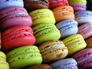
For this shoot, I would really like to take photographs of Macroons, this is the image that inspired me to do this shoot. I would really like to do this shoot in the studio, I love the bright light and the effective it gives your photos, it makes them so clear you can see everything, texture, colour and how yummy they look. I have never ate these before but have always wanted to try them so this is an excuse for me to try them as well.
If the studio is unviable it always a good idea to have a plan two, so I think that window light will be just as good, I know a lot of photographers use window light instead of studio light, natural light is very effective for these typed of shoots.
For props I think a nice elegant box set up would be really pretty, with a pastel colour tissue paper so that is doesn’t take the colour away from the Macroons. I think also a bright white plate would be good again because of the colours of the Macroons but the white might disappear in the studio because it is already very bright. I also think a dark vintage tin or box would be lovely because the Macroons would still stand out and it would add that little bit of a change of scenery to my photos make it more original . I think the arrangement of the Macroons is important, so I would be trying to experiment as much as possible. 

Some examples;


I plan to take these photos thought the day time at mid-day so that it is very bright just encase the studio is unavailable, I will be taking these photos on the Thursday 1st October when I am back at college so that I will have access the equipment and studios available.
Equipment I may need for my shoot will be a camera obviously, tripod maybe to get a steady shot, lights and maybe a reflector if I have to use window light because the studio is unavailable. If I was to use window light I would need a large window with a lot of space, the Kitchen in college would be grate replacement instead of the studio.
If I can’t bake my Macroons, to a decent standard I am going to have to buy some, to make them it will cost about £5 not much because I will already have a lot of the ingredients because my mum bakes a lot of random stuff all the time. If I was to buy these it will cost me about £5 to £10, they are very overpriced I’m not sure why, so if I buy them I hope they taste as nice as they look.
I will probably have to buy the packaging that I want to present my Macroons in as well, to they look nice and really lovely arranged maybe some tissue paper, it will be about £2 for the box and roughly the same for the paper.

I hope that I can make them myself and they will look amazing and it saves me some money. 

Healthy and Safety 
  • I will have to be careful of the wires and stuff to make sure I do not trip whiles I am taking photos. 
  • Make sure that no one bring drinks near the equipment just in case they spill it and it can course problems. 
  • Make sure that no one is messing with the equipment.
  • Make sure that everyone knows, where the fire exit is. 
  • Make sure that all the equipment is away and tidy so that no one trips or falls. 

Friday, 25 September 2015

Task 2


Food photography 4 Final images
This was the first photograph that I took it was of my drink of Coke I thought it would looks because of the piece of lime in it added contrast and helped it to look more interesting and not just a simple pint of Coke. 
I tried to keep the background out of focus so that you could focus on the main part of the image. I love how the lights in the background have gone to little lights I love this suttle light effect,  I would like to experiment more with this effect.  
I could have got more of the restaront in this image if I was to re-shoot this so you got more off the ceanary. 

This was the food I ordered I loved the contrast Betweem the food and then bright white plates and I love the colours of the food, I think this is what make food photography jump out because the colours can be very effective. I tried to just focus mainly on the rice and leave the main in the background, I was trying to experiment with depth of field. I tried to make it appear natural as well and nice looking to it didn't appear posed. Again if I was going to re-shoot I would take a wider shot because this photograph does feel a little cramped and squished at the sides of the image.
I love this photo it is the best that I took but it was sight out of focus which I couldn't tell on the day it appeared fine. So I had to try my best to sharpen this image because I thought it was a really good and interesting because the scene was different to my others it wasn't just my food it was the waiter as well which made it feel more classy and perfessional.  I also like how you get a bit more of the background in this photo so you can see the sort off place we was eating at and how it was set which can add a lot to an image.  If I was to re-shoot this I would make sure that the images was in focus because I know this would have made it loads better but apart from that I really like it.
Again this was one of my more natural ones trying not to just focus on the food and make it feel more relax, so you could get a feel of what it was like. I also though it would be good because people always photograph nice set out food before it has been touched but I thought I Would try something different so it's not perfect because nothing is. 

Thursday, 24 September 2015

Task 2 Crumbs


Crumbs 


In this image i tried to experiment with with scale and manipulation to make my cookies appear more larger, i think this is super effective, I really like this photograph and would consider this for one of my final piece.  

Again this is me trying to experiment with different Materials, i thought this would be a good idea to add texture to my photos and to make them more interesting.  


I wanted to get a close up of the cookies and I thought it would be good to try and do something different instead of just leaving them to sit on the side and take some photos. 


Again this is just me trying to include everything in my shoot and trying to make it appear more interesting by balancing the cookies. 

For this image I tried to make it appear like they where rolling out. i lefts some of the crumbs in to make it appear more natural but i have cleaned it up a bit so there wasn't just random crumbs everywhere. 


In this image I tried to experiment with depth of field, by leaving the cookies in focus because they are the main point of my image and the packaging in the background still there but not in focus. 

Overall evaluation of all my images
I had to edit most of these images, just to brighten them up and add more contrast. I had to edit most of my photographs to get rid of the crumbs and stuff, i did keep some in to make it appear more natural.
I personally prefer the the studio images because they are so bright and clear, but my last image is from window light and it looks very similar to studio work, so i can see why food photographer may use window light because it is just as effective.
In a lot of my photos i but a white netted sheet down in the studio to make it appear more natural, it also adds a little more texture depth into my photographs,
My prop that I brought in was a pug mug, its the only thing i really had to being at my house. I was thinking about doing interdependent shoot and using one of my Nans old cookie Tin, Its really old and had all these really nice designs on.
I also tried to experiment with different layouts and set ups to see if this changed the feeling and the message that it put across.

Thursday, 17 September 2015

Task 1 Research

Henri Cartier-Bresson(historical)


Henri Cartier-Bresson was a French photographer considered the master of candid photography, and an early user of 35 mm film. He helped develop street photography, and approvingly cited a notion of the inevitability of a decisive moment, a term adopted as the title for his first major book. His work has influenced many photographers.
After trying to learn music, Cartier-Bresson was introduced to oil painting by his uncle Louis, a gifted painter. But the painting lessons were cut short when uncle Louis was killed in World War I.
I couldn't find who took this photograph but  thought it was really interesting this is not something that you would see now unless you called and arranged this type of shoot. This is so creepy as well it would be perfect for a horror shoot. This is half a mine of dead meat.
I really think the older photographs are more interesting only because its something you don’t see any more really, such as these busy markets. I love how they are all black and white, there is no colour, photos like this you really capture the movement and how busy everything used to be. You can see how old it is because they are wrapping the fish in news paper. I like how it is all out of focus slightly apart from the exchange between the customer and market owner. Another reason I like this image it shows how markets have more communication then shops.

I like this photograph because it is different to most food photography photos because it isn't in a market or a super market its on a family day out having a pick nick, they food isn't nicely organised nice its natural and organic. I like how the setting is really relax and having fun. i like how they are dressed I think it would be good to re enact this photo and re-shoot it.

I like this because it feels like a classy evening and really fancy and posh, i love the whole suite and tie look.It sort off looks like there is steam going on the silver tray they are cutting and just next to his head. Its appear that the two men are at a buffet. I think personally it would be better if it was a wider shot so you got more of what was going on in this restaurant and it would stop the photo from appearing cramped and squished.

ORKUN ORCAN – UNITED ARAB EMIRATES/DUBAI (Contemporary) 


“I live in a world of shifting dunes, where beauty is in grains of sand, but gone tomorrow in the wind. I focus on the detail in the world around me. My clients include archaeologists, architects, artists, jewellers, manufacturers and restaurateurs. My pictures are mindful of the moment. Simple photographs, nothing more. 
I really love how he thinks of things and describe what he does, he seems really positive and he know what he wants and from is work. 
I love these photo because of all the beautiful colours they are so bright and inviting, and because they are so colourful it makes the drinks look really tasty. I also like how the background and the lemons are out of focus and the crushed ice is perfect it hasn't started melting there is no water or weird water reflection from the light.
I really like this again because of all the colour, I like how you can see the ingredients and then the final thing the pizza, i think when doing food photography, colours are really important because that is what catches you eye and invites you in.  Again the wooden chopping table helps it to jump out and really helps bring out the colours, i love the placement of the food you can tell a lot of thought has been put into it.


This less effective i think because the food colours are more natural and bull, not as vibrant as the previous ones. I do like the placement of the food and the peppers and stuff in the background again he has made the background is bluey and the main food is in Sharpe focus. I think that this was lit by window light
Online Mood Board. 

Comparing contemporary and historical food photographers
I thought that it would be a good idea to compare two pieces of work from different photographers and different times.  The obvious differences are the colour, the old one is black and white and the new one is in colour also the older one is more natural set, its just a man sitting eating his lunch, the new one is posed and set in a certain way and presented. 
The locations are completely different one is outside and the other is in the kitchen, also the older ones have a wider shot so you get a lot more in your photo but the newer ones are different they are close up so its only focusing on the main part of the image. 
I really like them both they are both very effective depending on what you are trying to accomplish and show with your photo. 


Friday, 11 September 2015

An apple a day


An Apple A Day 

These are all the photographs that I shot while doing this task. I had to take a total of 10 final photographs. We was focusing on using different techniques and locations in our photos. 


This is my first photograph that I shot, it was in the fresh laid grass outside college near the new building. I really like this photo because of how vibrant and colour full it is.
I like how it is slightly off centre and how it is all in focus. I also really like the contrast between the apple and the grass the yellow stands out Against the green and gives it more definition.
The shape of the apple also goes really well with the shape of the background and because off all the grass is vertical lines it surrounds the apples shape well.
If I was going to re-shoot this photograph I would get more of a skyline City background so that it wasn't so cramped and felt and looked more open. 

This image I found hard to shoot because I found the reflection was distracting and was taking a lot away from the apple and the glare was really bright. I like how shadow from the side of the apple. I really like how bright the apple looks against the bull grey plane background, it really helps my photo to jump out and grab people attention. 
If I was going to re-shoot this I would take it from a different angle and have a less dense shadow. 


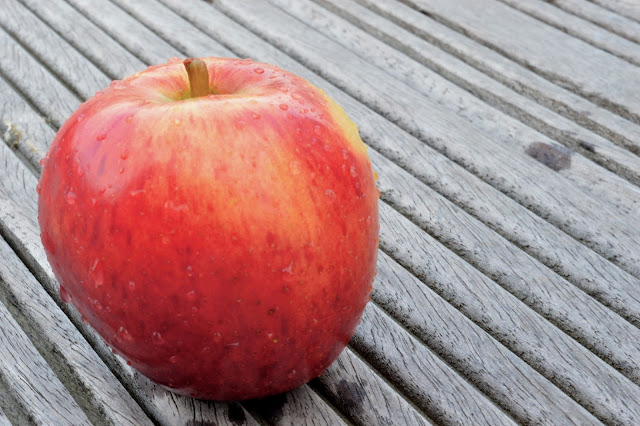
This is similar to my last photo the contrast is really bright and organic because of the bull background. I had to edit a little bit to make the colour of my apple more vibrant because it was looking very dull because of the lighting outside. 
I haven't edited to make it look colour splashed because it already look very similar to that effect because of the dark grey wood that my apple was sitting on. 
If I was going to re-shoot this I would maybe move to another part so that the wet parts on the wood wasn't distracting and taking your eye away from the main part of the image, which is the apple. 

I really like this photograph because of how bright and vibrant the colours are, they bounce of each other and work really well together to make it eye catching. I think because my hand is pale  it always makes it jump out more. 
The blue background reminds me of the bottom of a swimming pool because of the tiles and the different shades of blue. I did get this effect by editing my photograph on photoshop. 
If I was to re-shoot this I would take a wider shot so that it didn't feel cramped and squished in a single photo. 

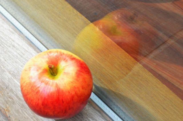
I tried to do something a little different with this photograph by getting the reflection in I think this is a really good effect because it makes the apple appear like it is rolling, it also help to to appear more 3d and less flat and boring. I edited a little bit so that you could see the reflection a little more so it was more effective and so you could see the Colours of the apple in the glass. I tried to get an apple and had a mixer off colours in so it just wansnt blocks of Color and it helped to brake my photograph up more. 
If I was to re-shoot this photograph I would maybe change the angle I shot at and maybe use a bigger brighter window so I could have a bigger but more effective shot. 

I like this photo because the colours and the lights are very harsh and in your face, i had to take a photo of someone with the object (the apple) I think because the horizontal lines on the bench it makes the apple stand out so much more because of the edit it is bright and hard to focus on. I think that if the background was a little darker that would be more effective and make the main parts stand out more. If i was to re-shoot this I would make sure there was no one in the background because i accidentally captured someone in the left corner in a blue coat. 

I tried to be more creative with this photo so that it was different and stood out a little more. Instead of using a person i used a shadow so it more interesting and different, it reminds me of little red riding hud because you always saw the shadow of the wolf on the wall of the house which made it so much more scary and mysterious. This image is in black and white and i loe how dark and ashy the colour has gone it just adds to that creepy effect which i love. 
If i was going to re-shoot his i would take it from a wider angel and get more of a background but i would make sure there was no people because that is distracting and easy to avoid. 

This is by far my favourite photograph even know it was dramatically edited on Photoshop to give the pinky/purple effect it looks amazing, it reminds me of Alice and Wonderland because it is so unrealistic but yet pretty and different. I just love the vibrant bright colours it really jumps out to me and it reminds me of a laptop screen saver you might set, i also made it a little of centre on purpose so that it appears more natural and not in your face.  If i was to re-shoot his i would take it so you could see more off the tree and even maybe a rabbit hole it it was more like the wonderland idea. 

This photo was taken on a window sill which i have never done before but i know that a lot of food photographers use this idea because it can give a better effect then all the artificial light. I used a white piece of paper to reflect some of the light back onto the apple from the other side, i like how this effect has made it appear lighter at the top and appear as if it is getting darker on the way down, it also helps to add depth, texture and helps you see the detail in the apple. 
If i was to re-shoot this again i would make sure that i didn't get the back of the window in the photo because it sort off ruins the bright white and perfect effective it gives off. 

This was my photo when i was trying to use artificial light which i don't think is as effective as natural light, i tried to photograph from a different angel so that it was a little different from my other photos and because it was so simple and had to background the angel is all it really had going for it. 
I think i have to work more with artificial light before i make a harsh judgement on it based on one photograph i have taken. 

Interdependent Shoot
I decided to do this independent shoot because i wanted to try a new idea by glueing together a green and red apple i thought that this would make a really good contrast. I also wanted to get some photo by myself so that i had somthing different from everyone else because when your walking around in a group everyone uses everyone ideas and its hard to get somthing original.  

I loved the idea off the two half of an apple to make one. I really like how the two sides of the apple have come together in this image, i didn't edit the apple to make it join that well, just spent a lot of time cutting it to make it as perfect as i could. I like how dark and cracked the bench tables are and the dark colour helps with the contrast between the apple. I had t sit on the floor in an awkward way to get this angel but i really think that it paid off. I like the contrast between the tree leafs and the sky it is very bright and not too harsh, so it doesn't appear over edited. 
If i was to re-shoot this i would maybe take it from a different angel but there was a ugly building behind so i tried to avoid it because it just looked horrible, dull and distracting. 

i really like this photograph because of all the autumn leaves i love all the colours, greens browns, yellows they are all quit dull and there is this lovely bright coloured apple in the middle, being the complete opposite and standing out. I like how the reflection on each side  of the different coloured half apples are different and make it appear different. I like how it appear like the apple has gone from green and as its got to the top and changed the red, all these half coloured apple photos remind me of snow white, this task has reminded me of a lot of fair tales. 
I really do love this photo i cant think of anything to change if i was going to re-shoot apart from making it appear the both sides of the apple matched up because one side did overlap a little and you can see it slightly in the photograph. 

This is one of my least favourite photo because i should have made my shutter speed faster so that i could capture the water with no blur. I like how the water is lined up with the middle of the water, I dont like the colour of the stone in the background, this was a drinking fountain thing in Pudsey park. I did notice that you can see water drops a lot more clearer on red apples maybe because it is darker.

I decided to colour pop this photograph because i thought i would add a little more interest because it is a simple photo but i think the water drop add a lot to this image, you can see that the apple isn't perfect in this image, but i didn't want to edit too much so i left it like that. i just love the contrast between the red and the green and i love how all the background is out off focus, this really help to focus and make it feel more organic and vibrant also if the background was in focus i think it would take a lot away from the water drops on the apple which look amazing.