Wednesday, 24 February 2016

Exposure meters/light meter

A light meter is used to measure the amount of light in photography. Photographers use this to determine the correct exposure for a photograph.
Ambient light is the light that exists in a scene. Also referred to as “natural light” or “existing light,” ambient light can be the found light inside a home, a restaurant or concert hall, or a bright, sunny day, a deep foggy day, a city at night...in other words, any kind of pre-existing light. This is found light, not additional light that you, the photographer, might choose to add, such as flash. When photographing a scene that is lit with any kind of ambient light, you need to use a light meter to determine exposure
The most common exposure method is via your camera’s built-in exposure meter. When shooting with a compact camera, determining exposure and setting the camera’s aperture, shutter speed and (in some cases) ISO happens automatically. With DSLRs, this also can happen when the camera is in Program or “green” mode, but you have plenty of other exposure mode options. You can have more control over exposure by choosing Aperture-Preferred, Shutter-Preferred, or Manual exposure modes. A less-common approach is to use a handheld meter, which measures light and provides exposure setting guidance.
incident light measures the light falling on your subject and how light or dark the subject is has no affect on the exposure reading.
Reflected light measures the light reflecting off your subject, and the color and value (how dark of light your subject is) affects your reading, requiring evaluation and experience to accurately apply this information.
In terms of speed, incident is the faster way to get an accurate, ready-to-shoot exposure of a subject in the same light or shade in which you stand. Reflected readings are very useful when your subject is in shade and you are not, or vice versa - but again, the reading you take with reflected can only be "ready-to-shoot" if you are indeed pointing at something that is "middle gray" in value.
The first time you use an incident meter is one of those "a-ha!" moments. Once you take a reading with the lumisphere, set the camera to same and find that your exposure is right on, we bet you will wonder how you ever lived without it!
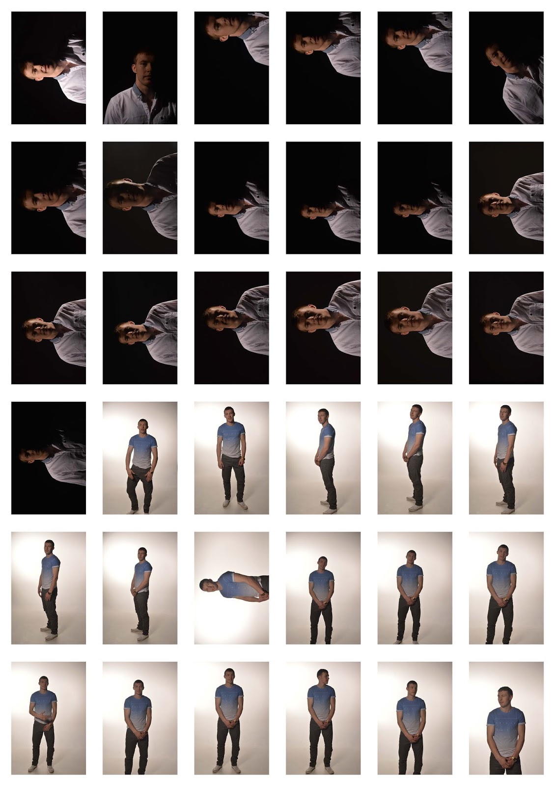
Incident metering tells you about the light you are controlling. The Sekonic Litemaster Pro L-478 Series light meters' Lumisphere (hemisphere receptor) is designed to read all of the illumination that falls on it, and the subject, including the key light, line light, hair light, eye lights, etc. Besides taking nearly foolproof exposure readings, this enables you to set up and light a scene before the principal talent arrives, saving time and adding to your presentation as a professional. You can also “walk the set” to measure the evenness of the illumination and perfectly light green screens.
The L-478 Series offers the convenience of a retractable Lumisphere. Retract the Lumisphere to read individual light sources to adjust them to the desired ratio, or read the flat subject. Extend it to take an exposure reading for 3-dimensional subject position.

Thursday, 11 February 2016

Men's Watch

These are the photographs from my men's jewellery shoot. I did not really have much men's jewellery to photograph but i thought this would be a good one, as it is very interesting. I like the contrast of the colours between the gold, black and the white/cream background.  I tried to photograph the watch from different angels to give different effects and to see how it makes the image feel and how this effects the image outcome. 

These are a few examples of photos I have taken and edited slightly.

I do like these photographs but the gold tone does appear a bit yellow and doesn't look as nice as it could have been. I think that when I edit the other photographs I am going to try and get rid of the yellow tones. 

I like this one loads but I dont like how you can see the back of the watch that spoils. 

Friday, 5 February 2016

Men's Causal Street Fashion Shoot.


These are my contact prints from the men's street fashion shoot, in this shoot i tried to experiments with different lights, such as soft lighting and really harsh and bright lights, i also used hard light witch I did not feel it was very effected for this type of shoot I am doing and does on work very well with the fashion theme in my case. 
I did not plan my shoot very well when it came to outfits and ideas so I am planning on re-shooting a better idea and trying to be more created this time, with more of a variety of clothing/outfits as well as different styles such as joggers and trainers, workout stuff, and even maybe swimwear and pj's. 
I do think that i would really benefit from doing an extra shoot because i dont think that i have a very wide range of photographs and i know i could do a lot better and be more created with my shoot.  


Some of my Final Photographs 
This is one of my images that I have edited, I have always liked black and white images, they always add the mysterious and texture to your images in my opinion. I thought that is I cropped this image as well I could use this to go at the side of a paragraph, because it is a really natural looking pose. I used a soft box and background lights to lighten this image. The clothing is really smooth but the background like did come across a little harsh sometimes and too bright. 
I personally think that the background light is very effective in this image because its darker at the top and the bottom and light in the middle which brings your attention to the phones and the watch, so i could also talk about the accessories. 

Again I was playing with the black and white image and decided to colour pop the watch just in case I want to talk about the accessories. I really enjoy colour popping it always looks really interesting and never fails to grab your attention.  I was using a soft box to take this photograph and Its gives this really soft smooth looks to clothing and skin. 

In this image I used a light box and background lights, I tried not to over edit my images and keep them looking natural. I do think that the background lights are a bit bright and over powering and that I maybe should have adjusted them a little bit before shooting. 

In this photograph I again tried to experiments with colour popping again, but I used a piece of clothing this times, which is a lot more natural and not as in your face as the watch it is still effective but it a more like a water colour, soft and less bright. 

I tried to get some closer photographs of the clothing instead of full body photographs so that i could talk about different things in my magazine, also when I was doing my research I saw a lot of images like this on internet shopping. Again this was taken with a soft box and background lights to, brighten it all up so the clothing is clear. 

Again I tried to take more focused shots. 


Thursday, 28 January 2016

Mens Street Fashion & Magazine Research

I have decided to do Men's casual street fashion because I feel like this is something I know well and i wanted to create a magazine that I know I would be able to talk about. I also think that this is a very open shoot and can still be very interesting depending on how created you decided to be.  As for my final product I will be creating a magazine so I might create a casual and then a smart page, but both for affordable prices.

I have got some examples of magazine speeds and covers that I will help to inspire me with my own magazine and to help me generate layout ideas.

I am not too sure about the page spread personally this is not something that i would do myself. I think it looks too serious and I would want my magazine to look more fun and colour full, this page spread is very plan and basic.

I like this one because it think is it always important for people to have something to read, I don't think anyone wants to buy a magazine that is full of images only and no writing its pointless. I also like all the cropped products and accessories to help fill up the page and it helps to add colour.

I also like this one again because of the layout, how it has one page that is focused on an image and then the other is on a story but obviously my magazine is going to be about fashion so it may not contain as much writing as some other magazines. 

I love the photograph style I think this is something I could easily created out on location. I also really like the translucent writing over the image, it really helps to brighten it and gives it that modern look and feel about it,

I really like the image layout again for this, not so much all the writing but I think this would be a good idea for a page I also like the contrast of the images.

These are some examples of magazine covers that I could recreate and help to inspire me.

I really like the busy cover look, I am not too sure about it over lapping the writing on the image, to me its feels really cramped and squished.

I definitely prefer this cover because it is simple, light colour and it is very welcoming, the text doesn't over lap too much with the image and all the colours work very well together to create a nice even contrast.  I like the simple plan background I think that it is very easy to work with.

mens modeling poses

This is a small collection of images of male model poses, i thought it would be a good idea to look at male poses to help my model and to help me direct them. This was also very helpful to give me the idea on what type of poses, I wanted to use and what effect they make give, this also helped me to decided what type of like I wanted and which one would be most effective.


Friday, 22 January 2016

High Key And Low Key And Lighting Attachments

These are a few examples of high key lighting, this gives a very bright and white effect to your images. It also makes everything appear very clean and crisp, you get every part of your object with no shadows. I think this is a good technique for very clean bright photograph, it is good for positive, happy images, or if you want some features to stand out more then others you make make them darker and have a light and pale background. 


These are examples of  low key lightning. They are a lot more suttle and gentile to look at. They make the skin appear really smooth and clear, this kind of lighting is good for very dark photos, when you want that dark feeling of fear, scary and different emotions. I also think this is good when you want to focus on different things and make the jump out to your viewer so they don't get distracted. 
Beauty dishes are a great tool for any photographer; the light produced is harder than a softbox but softer than an umbrella. You can also add different modifiers to change how they work. The light can be made harder when you use a grid, which you’ll see below, helping to add to the versatility of the modifier.
Shooting in the studio has many benefits and having total control over your lighting is one of them. You can let your imagination run wild and visualise endless ways to shoot your subject. That’s the fascination for me, using any number of different accessories to create subtle effects and mood changes. To do this – to create those different moods – needs a type of accessory that will control the light and give very small, controllable pools that we can use like tiny brush strokes.
Soft light
Soft light is light that creates shadows with a gradual transition from light to dark. There are no hard shadow lines. It is created from a scattered or diffused light source. Soft light is found where the lighting is indirect or where it passes through a diffuser, clouds or some other medium which scatters the light. Diffused light can be light that has bounced off one or more surfaces before it hits a photographic target.
Hard light
Hard light creates shadows with a sharp edge. There is a negligible transition from light to dark. Hard light is created by strongly focussed light travelling from a small (or relatively small), single-point light source like the Sun, a focussed beam of light, or an undiffused light bulb).
Standard reflectors are your everyday reflector for the studio flash head. They’re usually made of metal (with a silver matte interior finish, a polished silver finish or a granular metallic finish), and they direct the light output in a 90 to 120-degree beam. A standard reflector is the typical light/reflector set-up for shining the light into bounce cards, through diffusion, and grids or cutters. One thing to know about standard reflectors is that the wider they are, the softer the light you get from the lamp unit. Additionally, the shape and interior finish can affect “softness” of the light. While standard reflectors seem very basic in their usage, they should become a staple in your studio lighting set-ups.

Soft boxes work by confining the light from a lamp into a closed chamber and releasing it through at least one layer of diffusion material. As the light passes through the translucent fabric it scatters, producing a very even and soft result.Uses for the soft box fall predominantly into two categories: Key Light, as the principle light source, and Fill Light, as a secondary light to reduce contrast. Although any style of light source can be used for key or fill applications, the use of a harsh light for fill renders a poor result. Soft boxes, on the other hand, are perfect for fill light because they don’t cast harsh shadows.


Thursday, 21 January 2016

Fashion Photographers Research.

Contemporary 
Steven Meisel 

  •  is an American fashion photographer, who obtained popularity and critical acclaim with his work in US and Italian Vogue.
  • He is now considered one of the most successful fashion photographers in the industry, shooting regularly for both US and Italian.
  • He was born in 1954. His fascination for beauty and models started at a young age. At that time Meisel would not play with toys, but would instead draw women all the time. He used to turn to magazines like Vogue and Harper's Bazaar as sources of inspiration for his drawings.
  • One of Meisel's first jobs was to work for fashion designer Halston as an illustrator. He also taught illustration part-time at Parsons.
  • Meisel is notorious for rarely giving interviews or being photographed. However, in one of few cases, he was interviewed by Ingrid Sischy for Vogue Paris.


I think that this photograph is definitely very effective because of the black and white contrast also I think it has a lot of juxtaposition, I don't know if the photographer was aiming for all this contrast and opposites and it all works really well together. I love the bold fashion, its not something that people would imperially wear now. I think that is why I like fashion because because you can be bold and wild because it is very open to interpretation. I do not think that this was photographed in a studio I think that it was taken outside against a wall, using natural light as well as artificial light, you can tell this because of the shadows and the contrast.


This image is just so creative and different it appears to me that it has been taken on a film camera because it has that feel and effect about it, I love the background effect it is so different and the contrast between the girl and the white smoke and the blue background and the white smoke, it all works really well. I am really not sure how this photograph was taken it looks really interesting and the contrast is amazing, i love how it looks, I think that this is somthing i am going to look into and maybe try a little bit myself.

Alex Sainsbury 

  • "It's not been easy finding myself a position in the contemporary art world," admits the supermarket heir Alex Sainsbury. 
  • Now, after two decades on the sidelines of the contemporary-art world, the 41-year-old has finally found his calling in the shape of an 18th-century grade one-listed building tucked away in a lane on the edge of the City of London.

Dj By Dominic Jones
I think that this is the type of image that you would find in a very modern magazine, or on a fashion blog. I think this photograph is very dark but soft and elegant because it has got very dark bold colours, blacks and reds. But it also has very thin silk clothing and smooth curly soft hair, which gives it the soft feeling. I think that the pale skin and the light jewellery use is also making it more elegant, it makes it more casual and less sexual. I think that this photograph was again done in the studio again I think they used a soft light box, to get a wide range of light that is all even and smooth across the full image.

This a different type of fashion genre, its not focusing on clothings it is a little bit different it is focusing on beauty side of fashion. I think they photographed this in a studio, using a soft box or a beauty dish, because of the lack of shadows but the bright clear lightening. I like modern fashion because it is so bold and crazy and different this type of photography really allows you to think outside the box an be creative.
Historical Photography 
Herb Ritts 

This photograph was clearly photographed in a studio, even though the light is clear and there is no shadows on the background but there is one of her body but I still think they used a Maybe a slandered reflection disk, this is just a guess I am not sure as I have never used this equipment so i am not sure on the effect. This image is very to the point nothing to distract your eyes, this is also interesting because of the pose the model is doing which is different compared to other fashion photographs I have researched so far. Even know it contains nudity it is still very clean clean you cant see anything that some people may say is inappropriate.  
I really like this photograph because it is very playful and fun, i think when it comes to doing my own shoots it is going to be really dark and mysterious or really cute and positive. I am not sure if this is in a studio or just in a normal room, but they have used a very bright light i am not sure if it was photographed in black and white or later changed to black and white, but I love the effect that this gives, I think colour popping the bow on her head would really make it jump and stand out a lot more to an audience.  I really like the elegant nudity and the old fashion hair looks so pretty I think that this is somthing that i would consider using when i do my own shoot.

Francesco Scavullo 

  • Francesco Scavullo (January 16, 1921 – January 6, 2004) was an American fashion photographer best known for his work on the covers of Cosmopolitan and his celebrity portraits.
  • Born in Staten Island, Scavullo began to pursue his fascination with images of beauty by picking up his father's camera and taking snapshots, using his sisters as models.
  •  He soon moved on to Vogue. Scavullo spent three years as Horst P. Horst's assistant, studying Horst's techniques.

A lot of Francesco's work is in this dark, black and white effect. I liked this photograph because I really like this fashion look, it is almost vintage and it starting to come back into fashion, the high waist denim jeans and the white tucked in shirt. I think that this was taken in the studio using low key light, because it is not very bright but still lit up enough for it to be clear. Again the pose done by the model is very effective because it is different and makes it jump out to the viewer.

Again I think that this photograph was taken in the studio using low key light using a light box, to influence and spread the light to make it appear clear and natural. This one does appear to be a little bit more up to date and more fashionable, I love the big messy hair look and the white jeans with the pale nail varnish but the tanned skin. The black top and the white jeans are the perfect contrast and juxtaposition and the tanned skin works well with the background, so that it all doesn't blend he wants to model to be bold but not too heavy and dark on the page and i think he does this well.  

Friday, 15 January 2016

Final Evaluation

Task one was again like at the beginning of every new task was just research, which I understand its always good to get some ideas and inspiration for your project, but it can get very boring and dull most of the time and it would be good if we could mix it up a little bit.   
Task two was another research task. We were asked to research photographic processing laboratories. I did not enjoy this task research is deftly not my favourite thing to do and I only managed to find anything apart from pro-am. When I was looking on-line for others I couldn't find many and any i did find, didn't have any clear online information. 
Task three was to go out and photograph digital images of glass. I liked this task as it enabled us to get out of the classroom and to do some photography. However, finding interesting glass things in Bradford was difficult and for it to be different was hard as well because we photograph in Bradford a lot and it again can get very boring and bull. 
Task four was to go out and shoot a black and white film. I decided that I would go out into Bradford and try to get some interesting photographs which was difficult, it wasn't very nice weather which benefit me as it means that I could go out and try get some interesting photographs of the rain, which I has never done before. Photographing rain can be difficult and very cold but I got some very interesting images from this shoot.  
Task five was again, a black and white film however, using an object. I decided to photograph my glass crustal ball and a jack dandles bottle I used the this to manipulate the reflections and make the appear different, i enjoyed playing with the angles to get different effects. 
Task six was to do risk assessments for the darkroom including the do's and don'ts. It was a very simply, straight forward task and it didn't take that long to complete. It was good to refresh the memory of the rules in the darkroom as we haven't been in for so long.
Task seven was my favourite task by far. It was to shoot reflections. I really enjoyed looking for the reflections and trying to get the most unique ones. although the majority of the time was spent looking for them, I enjoyed photographing them and finding out what apatures will would work and what wouldn't.
The comparison shoot was very interesting. I liked enjoying shooting on both camera's side by side to see the differences and also to see how different but how sometimes how similar the images come out on colour film and digital. I really enjoyed it. I always enjoy photographing with film the outcomes are always interesting and different every time. 
The Christmas task was pretty easy. It was to simply photograph baubles and lights. There wasn't much too it therefore, it felt like it was just taking images. I did not really enjoy this as Christmas is not my favourite. 
Task ten was to manipulate your images. I found this very frustrating as I am terrible on Photoshop and always find it difficult. When i stopped getting stressed and started to play around a little it all become easy and was more fun. 
Putting a person in a bottle was one of the easiest to do when it came to photo manipulation. It was quite simple when it came to photoshope however, whilst in the studio and getting the right positions for the model to be able to fit in was quite difficult however, it came out very well. I enjoyed it a lot.
Over all this Unit taught me a lot about photoshop and I enjoyed being able to go into the darkroom again. I really enjoyed the amount of freedom we had and I also liked playing around in photoshop.